1. Thank god we didnt choose Boston Act. B link or Blink or what ever it is was a good choice. It is not to a silly acronym (I think), sounds good when said, a very clean sound, and certainly conveyes the idea of linking things together with out being to specifi. My only question is if we are trying to duplicate this website in different cities would they also be called B link or would they be... NY link or S Link (Seattle)
2. Colors are good. Subdued but with a nice blue highlight. Not to Facebook as some people had feared.
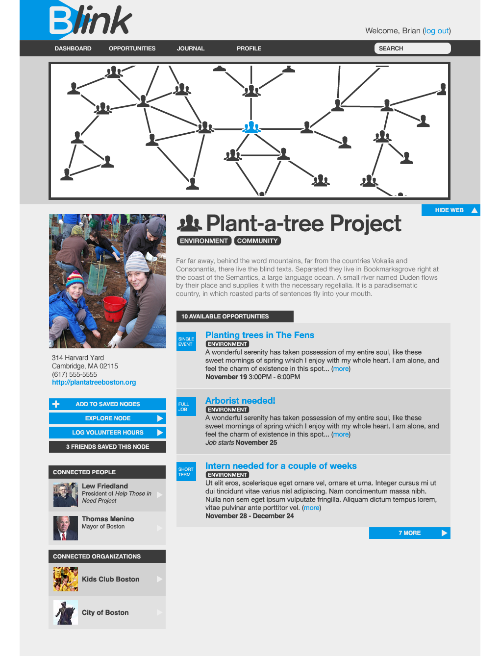
3. We need to replace the word node with something more easily compehendable. Maybe trying to brand a nodes as a "link"?
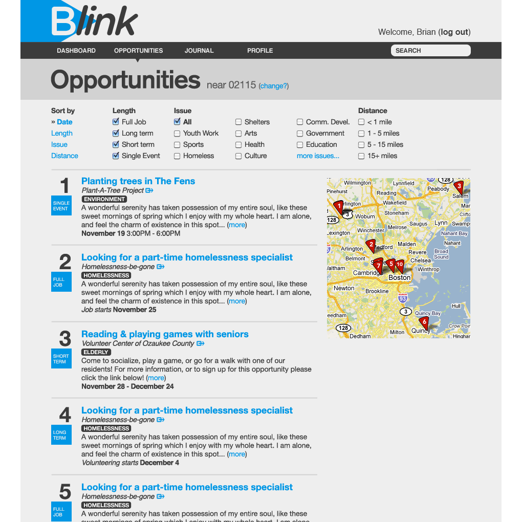
4. On the opprotunities page, I like all of the sorting opportunities but is there somewhere on the site a calendar of all events that is browseable by date? That is a way that people are already comfortable with of looking for volunteer oportunities and would be helpful.
5. The grey bar along the top with the search bar is pretty important. What are Dahsboard and Journal? It seems that that top bar should have Map, Oportunites, Profile and search.
I don't have too much feedback on these mock ups because they look pretty good in pdf form. I want to see how they function as a website we actually interact with.
I honestly thought our website looks really good. It looks professional and reliable.
The mini bar on the left side with one dominant picture and the contact info serves as a little brief organization tool for a browser to use the website more easier. However, on the actual page of each organization. I agree with Daniel to sort by date - and label "single job, full time, etc." Because I tend to search through things by date, also.
I really think it is very relevant to add in the connecter (persons) on the left (which we already have... :D) because browsers can directly contact each individuals if they way to.
The opportunity page is great. I was wondering though... are we using yelp or google map to make the map on the side? And are we going to have directions provided for browser for each events? Because it would be super useful!
Lastly, I have a tiny question. Should be have a page of our own... and describe a little bit about us. What are we doing? Why are we doing it? etc.
I agree with much of what has already been said. I think that the 'look' of the mock ups is great, and the real test will be the user-friendly-ness of the pages. As a start to this, I think that making the language of the page more accessible would be a good thing. Like Daniel mentioned, 'node' is a word that most people do not identify with, however I don't think that 'link' is an appropriate replacement, as links will end up serving a distinct role as the connections people make of the site.
I think that having the 'opt in / opt out' boxes to check for what kind of opportunities users are looking for is great. To address the searching by date issue, could that be another box to check? Ex" this week, this weekend, this month," ? Also on the subject of time/calendars, I would like search results to automatically come up chronologically, as in opportunities going on today at the top etc. (Much like how TuftsLife is set up)
Would it be possible or helpful to have a "Get Started!" page for new users? It could briefly explain the general layout of the site, what each tab means. Also, it could give suggestions for usage of the site, while encouraging people to use it how it best suits them.
Finally, I agree with Honey about creating our own page. I know that this specific group of students will not always be active on the site, but I still think it would be a good idea.
My first impressions about the new desing:
ReplyDelete1. Thank god we didnt choose Boston Act. B link or Blink or what ever it is was a good choice. It is not to a silly acronym (I think), sounds good when said, a very clean sound, and certainly conveyes the idea of linking things together with out being to specifi. My only question is if we are trying to duplicate this website in different cities would they also be called B link or would they be... NY link or S Link (Seattle)
2. Colors are good. Subdued but with a nice blue highlight. Not to Facebook as some people had feared.
3. We need to replace the word node with something more easily compehendable. Maybe trying to brand a nodes as a "link"?
4. On the opprotunities page, I like all of the sorting opportunities but is there somewhere on the site a calendar of all events that is browseable by date? That is a way that people are already comfortable with of looking for volunteer oportunities and would be helpful.
5. The grey bar along the top with the search bar is pretty important. What are Dahsboard and Journal? It seems that that top bar should have Map, Oportunites, Profile and search.
I don't have too much feedback on these mock ups because they look pretty good in pdf form. I want to see how they function as a website we actually interact with.
I honestly thought our website looks really good. It looks professional and reliable.
ReplyDeleteThe mini bar on the left side with one dominant picture and the contact info serves as a little brief organization tool for a browser to use the website more easier. However, on the actual page of each organization. I agree with Daniel to sort by date - and label "single job, full time, etc." Because I tend to search through things by date, also.
I really think it is very relevant to add in the connecter (persons) on the left (which we already have... :D) because browsers can directly contact each individuals if they way to.
The opportunity page is great. I was wondering though... are we using yelp or google map to make the map on the side? And are we going to have directions provided for browser for each events? Because it would be super useful!
Lastly, I have a tiny question. Should be have a page of our own... and describe a little bit about us. What are we doing? Why are we doing it? etc.
I agree with much of what has already been said. I think that the 'look' of the mock ups is great, and the real test will be the user-friendly-ness of the pages. As a start to this, I think that making the language of the page more accessible would be a good thing. Like Daniel mentioned, 'node' is a word that most people do not identify with, however I don't think that 'link' is an appropriate replacement, as links will end up serving a distinct role as the connections people make of the site.
ReplyDeleteI think that having the 'opt in / opt out' boxes to check for what kind of opportunities users are looking for is great. To address the searching by date issue, could that be another box to check? Ex" this week, this weekend, this month," ? Also on the subject of time/calendars, I would like search results to automatically come up chronologically, as in opportunities going on today at the top etc. (Much like how TuftsLife is set up)
Would it be possible or helpful to have a "Get Started!" page for new users? It could briefly explain the general layout of the site, what each tab means. Also, it could give suggestions for usage of the site, while encouraging people to use it how it best suits them.
Finally, I agree with Honey about creating our own page. I know that this specific group of students will not always be active on the site, but I still think it would be a good idea.